


Light Colour Kitchen Inspiration
If you're thinking about redecorating your kitchen or giving dark cabinets a new lease of life, choosing the right paint colour is important. Although darker shades can be effective, light shades are far more versatile.
In smaller kitchens, whites and neutral paints are a great choice for walls and ceilings. Once you've settled on a wall colour, you have free rein when it comes to painting cabinets and introducing accents. You can spice things up with a contrasting colour or stick to natural tones for a more understated interior.
If you're starting with white walls, experiment with more daring shades from the colour wheel when painting kitchen cabinets. Furthermore, make full use of architectural details like exposed brickwork and an existing feature wall.
A lighter colour palette is the perfect fit for larger kitchens. However, it can also transform a compact space that's lacking in square footage. Even grey paint tones can help give the illusion of space, allowing you to make full use of natural light.
Need some inspiration? Read on for everything you need to know about incorporating light colours into your kitchen.
Five Light Kitchen Styles
Running low on kitchen design ideas?
We've put together five winning kitchen styles that make effective use of a lighter colour palette. Whether you prefer modern minimalism or more traditional touches, you're bound to find something that ticks every box.
Elegant Light Colour Kitchen Ideas
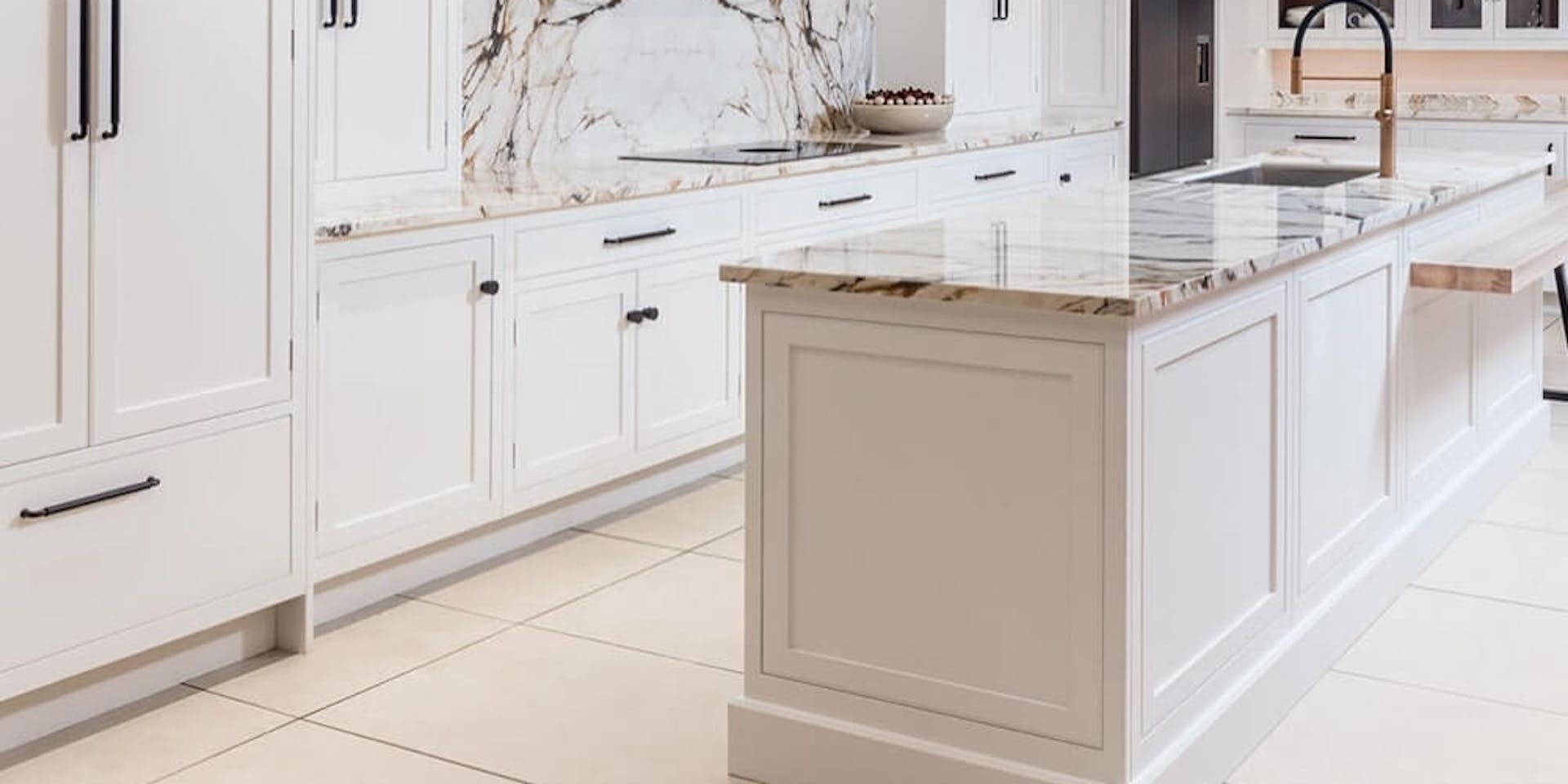
If you're lucky enough to have a larger kitchen, think about opening your space up with crisp whites and neutral accents. All-white kitchens are sometimes considered high maintenance, but with the right paint colours, you can turn the heart of the home into something truly elegant.
Use crisp whites or light neutrals to transform lower cabinets and wall units. These lighter shades work particularly well with marble counters and wooden work surfaces. To create contrast, think about introducing open shelving made from dark wood. For a modern twist, don't be afraid to add the occasional pop of colour.
Searching for the perfect neutral to make over your kitchen? How about Paper F497? This stunning off-white paints looks great on walls, but can also be used to give kitchen cabinets an instant facelift. Perfectly suited to natural materials and earthy tones, this timeless neutral also works well with more vibrant colour contrasts.
In the market for a more muted backdrop for your kitchen? Our Winter V503 paint colour is an easy choice. With pale blue undertones, this one works well with white cabinets and darker units alike.
If you want to go even lighter, consider our Arctic Fox S503 paint. This works well as a wall colour, but can also be used to coat cabinets and shelving. Keep things simple with black contrasts and accents, or mix it up with metallics and jewel tones.
Colours Mentioned:
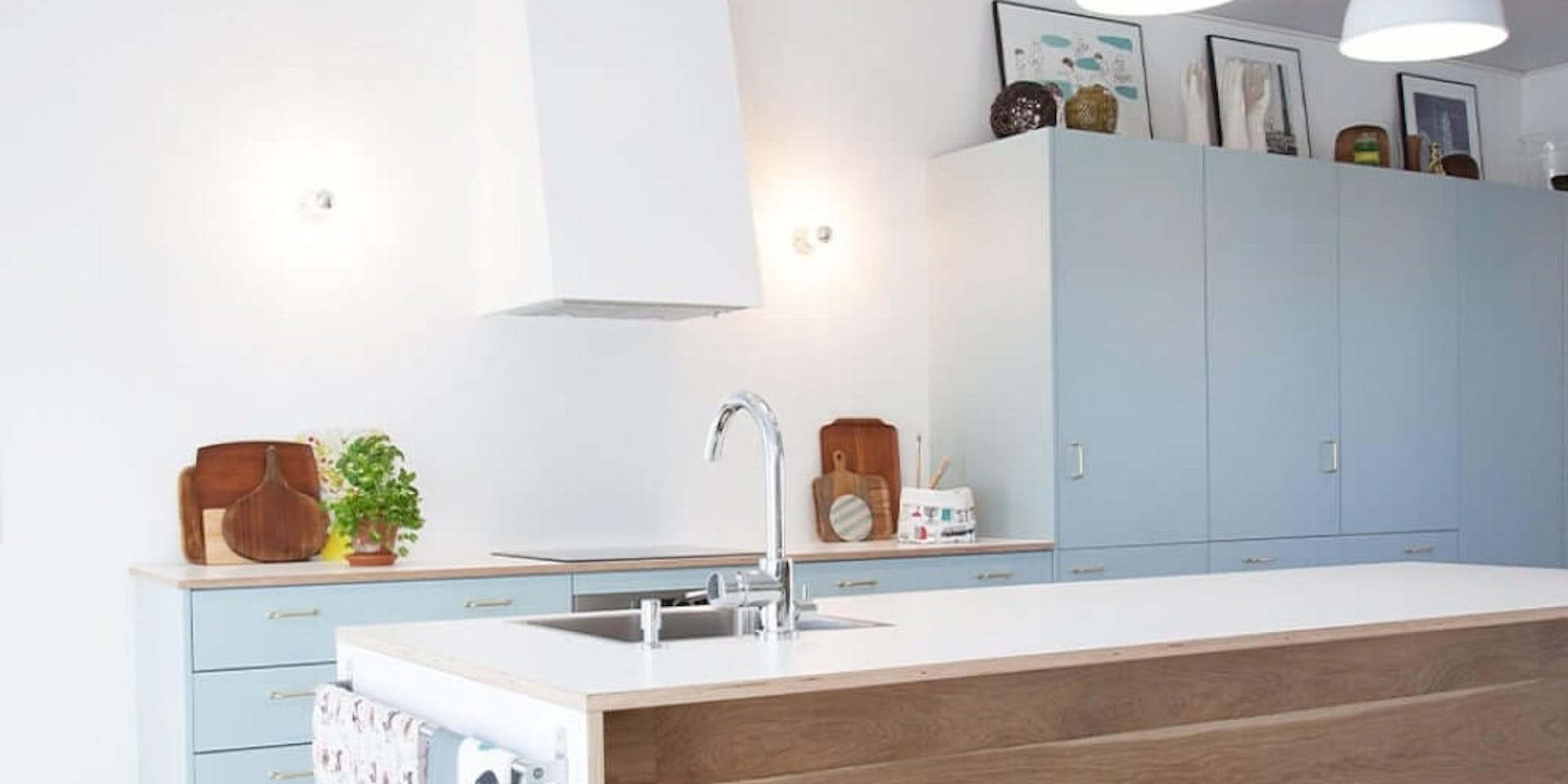
Light Kitchen Colours for Pairing with Natural Wood
Natural wood can add depth to a kitchen. In a contemporary kitchen, sleek panelling can provide a welcome burst of character. If you have the square footage for a freestanding island, a hardwood counter can serve as a stunning kitchen accent piece. However, for these natural elements to work, you'll need to think carefully about kitchen paint colours.
Light shades work best if you're using wooden elements in your kitchen, allowing the natural grains of the material to shine. If you're using woods to complement your colour scheme, picking the right shade is even more important.
Thankfully, we've got plenty of premium options for you to consider. If you want to add a burst of colour to your kitchen, our Cumulus Y354 paint is a strong choice. This sky blue shade is perfect for cabinets and pairs well with white walls. Furthermore, it's the perfect partner to oak or maple worktops.
If you want a more muted blue paint, Forget Me Not H353 is the way to go. Use this as a wall colour if your kitchen is fitted with cabinets. This blue is also pretty versatile, working well with light oak and darker woods alike.
Sometimes, a more subtle shade like Glacier Y435 is called for. This light blue is a good option for smaller kitchens, especially if you need to make full use of natural light. It's also perfect for repainting older cabinets that have seen better days. If you want to add more depth, don't be afraid to accent with dark blue details.
Colours Mentioned:
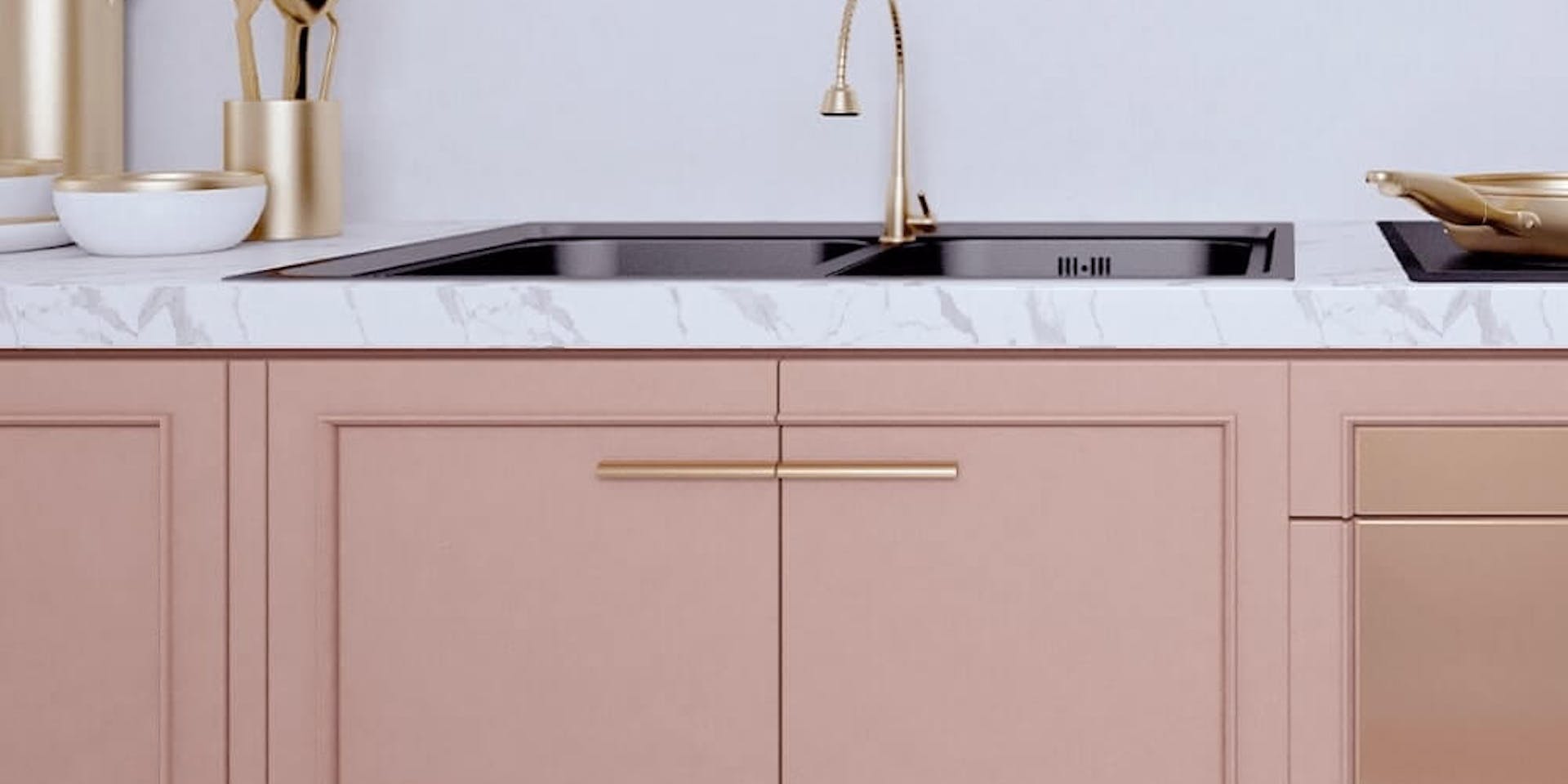
Use Dusky Pink and Purple to Create a Designer Kitchen
If you're not a fan of neutral shades and all-white interiors, there are plenty of warmer tones to play around with. Colours like burnt orange and dusky pink can make a room feel elegant. Furthermore, these elegant colours are transformed when paired with the right accents.
To achieve a more luxurious feel, it's all about the details. When choosing cabinet hardware, go for gold and copper tones. If you're looking to stick to a tight budget, you can achieve a similar look by using brushed brass.
In a designer kitchen, it's the cabinets that require the most attention. Create a blank canvas with off-white or neutral wall paints, then start adding character with warm cabinet tones. Richer shades like merlot and maroon work well in larger spaces, but a lighter palette is always best for a smaller kitchen. What's more, lighter colours pair beautifully with marble and granite worktops.
Need some ideas? Our Empress X477 paint colour is a premium option for anyone who loves purple colours. This stylish shade will instantly transform your kitchen cabinets and is easily coordinated with other colours. This muted purple looks great with white floor tiles and window frames. When it comes to the finer details, use brushed brass or silver hardware.
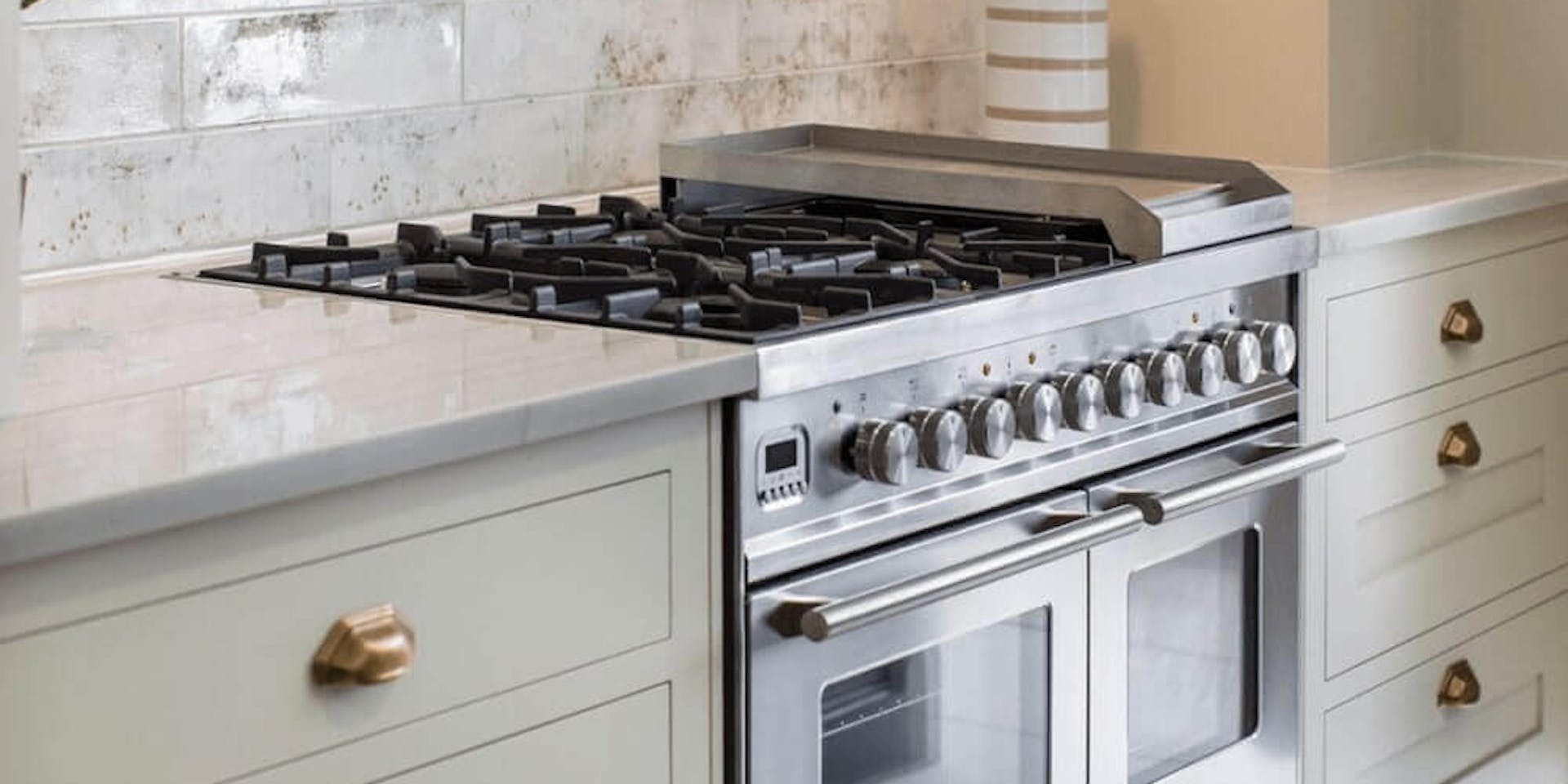
Our Maiden X420 paint is a lighter option. Thanks to its grey undertones, this elegant purple is easy to work with. Best paired with chrome or silver hardware, this paint also goes well with stainless steel appliances.
If you want to scale things back a little, consider Sunday H480. It might be on the lighter end of the spectrum, but this purple paint isn't lacking in character. You can use this one for cabinets or walls alike. To make life easy, stick to whites and muted greys when adding accents and accessories.
Colours Mentioned:
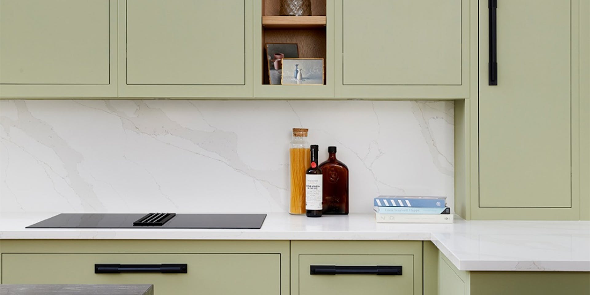
Use Gorgeous Green to Increase Maximise Natural Light
A green colour palette is ideal for any kitchen, especially if you go for a lighter shade. Mint green cabinets can freshen up a small space, while olive green palettes are perfect for larger kitchens.
Furthermore, greens are incredibly versatile. They work well with white and neutral shades and effortlessly complement brick walls and raw materials. If you're not afraid of a pop of colour, use green paint to coat kitchen walls. Alternatively, reserve your palette for cabinets and shelving.
Thinking about going green? Our Aloe X381 paint is one of our more subtle shades. This muted green is a good choice if you're looking for something light to freshen up your cabinets and works well with monochromes and light woods.
Looking for a neutral shade to work into the mix? How about Muse G384? Use this one for walls if you're embracing the elegance of green cabinets, or use it to add depth to cubbyhole inlays.
For something that falls somewhere in between, go for Cucumber Y383. This neutral shade has subtle green undertones and is the perfect pick for cabinets in a more contemporary kitchen.
Colours Mentioned:
Give Dark Cabinets an Instant Makeover
Dark cabinets work well in contemporary kitchens with more square footage. However, too many dark shades can overwhelm a tiny space. If you want to freshen things up, a new lick of paint in a lighter shade is the way to go.
We've got plenty of options for anyone looking to overhaul their kitchen units. Our Camelia F300 paint might be subtle, but it's the way to go if you're after understated elegance. Use this one to repaint drawer and cupboard fronts and finish the look with black pull handles.
Prefer a paint colour with warmer undertones? Calla G503 is sure to impress. With a subtle shot of lilac character, this premium paint colour can be coordinated with more daring pinks and purples, as well as monochromes and brushed brass hardware.
If you want to strip things back to basics, go for Jasmine F503. This timeless paint colour can be used in contemporary spaces, but it will also work well in a traditional kitchen. Once you've repainted your cabinets, work in some bold colour accents to add warmth.
Colours Mentioned:
Light Kitchen Colour Palettes
Still not sure which shade to use for your kitchen makeover? Read on for a first-rate pick of premium paint colours that will transform any kitchen.
Icy Blue Kitchen Colours
Blue colours work incredibly well in any kitchen. Our Glacier Y435 paint colour makes an instant impression, with plenty of pale blue character. Coordinate with light greys, whites or tonal blues for maximum impact.
In the market for something darker? Indigo L429 will go down well with anyone who loves royal blue shades. Accent this one with tonal blues, greys and gold-tone hardware.
If you'd rather stick with a more neutral shade, give Arctic Fox S503 a try. The perfect alternative to classic white, this neutral boasts icy blue undertones and can be used to repaint cabinets or coat walls. For best results, opt for black when picking out hardware.
Rich Blue Kitchen Colour
For fans of richer palettes, we've plenty of bolder shades to brighten your kitchen. Our Snowdrift L503 paint is perfect if you want to keep things simple. This pale blue will create a blank canvas for walls, while it can also be used to freshen up kitchen units.
For a bolder splash of colour, think about using Silk Road S440. This stunning teal shade is just the ticket for tired cabinets in urgent need of a makeover.
Too light for your liking? Our Royal M436 paint colour will suit those looking to make more of a statement. This royal blue works well with white walls, gold accents and light countertops.
Light Pink Kitchen Colours
There's always room for pink and purple in the kitchen. Our Jasmine F503 is a more subtle choice if you want to keep things muted. This neutral shade comes with beautiful pink undertones. Use it to repaint cabinets and complete the look with brushed brass handles and cabinet details.
If you prefer duskier shades, our Halva G459 paint is perfect. Although it's a lighter choice, this classic colour makes an instant impression. You can use this one generously in smaller kitchens, without worrying about overwhelming the space.
Finally, there's Tamarix K480. It's a richer option than our other paint picks, but it's light enough that it can be used in the smallest of kitchens. When it comes to colour pairings, you're spoilt for choice. White and grey work particularly well, while gold and silver will add a touch of elegance.