


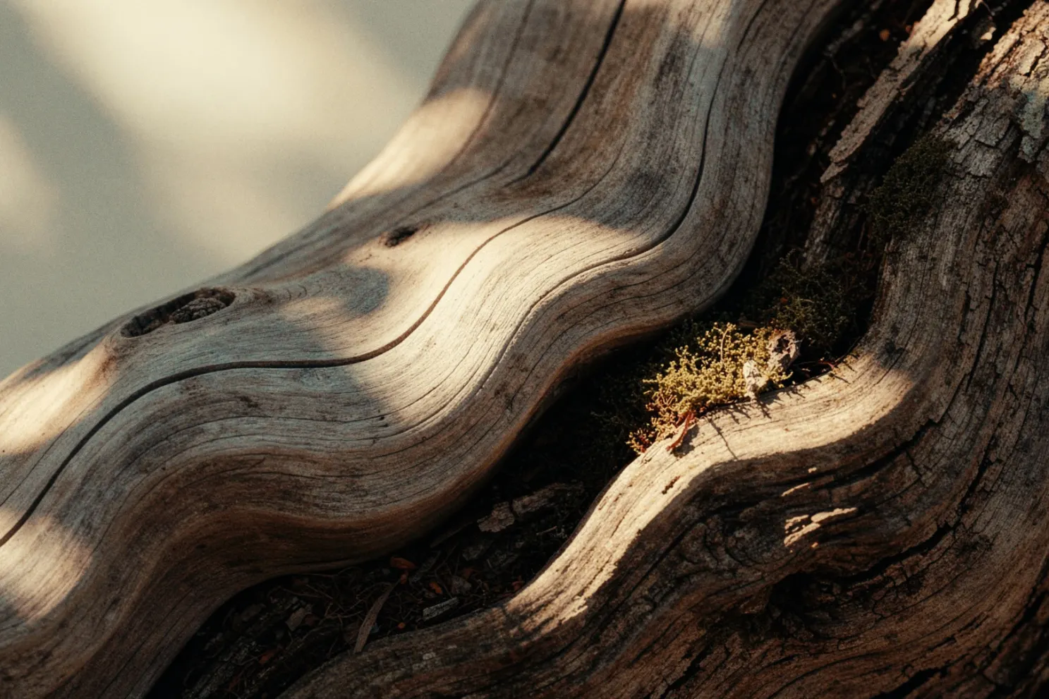
From that common foundation emerge three distinctive colour stories: Solid Ground, Quiet Zone and Life Shared. Each responds to a different aspect of modern living and offers its own approach to bringing colour into the home.
One Colour, Three Directions
Heartland S483 is deliberately versatile. Rather than belonging to one particular look, it provides a foundation from which very different interiors can develop.
In Solid Ground, it sits alongside earthy greens, browns and natural accents. Quiet Zone surrounds it with softly greyed colours and delicate pales. Life Shared takes it somewhere more energetic, combining warm natural shades with fresh pastels and softened primary colours.
Together, the three palettes show how a grounded neutral can become the starting point for much more than a neutral interior.
Solid Ground
Colour rooted in nature.
Solid Ground reflects a renewed desire to build, design and live more thoughtfully. Inspired by ideas of conservation, circularity, regenerative design and time-tested knowledge, its colours reconnect interiors with the natural world.
Grounded greens and browns form the backbone of the palette, complemented by natural neutrals and carefully chosen warmer and cooler accents. The result feels robust rather than rustic: a reassuring colour story designed around longevity, materiality and a sense of permanence.
The deck describes the finished palette as “grounded hues and natural accents” creating strength and reassurance.
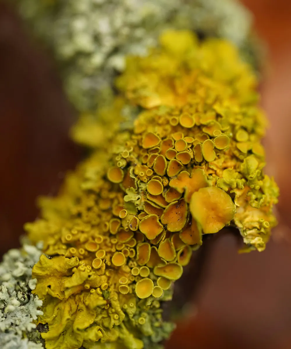
Solid Ground
Heartland S483 A Cool Beige Neutral Granulite K484 Pale Stony Brown Chalet N485 A Warm Natural Brown Grotto M449 Winter Forest Green Sepal L447 Deep Olive Green Beeswax L396 A Sunny Shade Of Mustard Orange Charm S427 A Delicate And Soft Purple-Grey TVT K459 Cool Brown With Grey And Green Undertones Paper F497 Pure White Madras N411 Burnt Earthy Red Cumulus Y354 A Calming, Light Blue Hue Denim N429 A Deep, Bold Shade Of Blue Ficus N378 Deep Forrest Green Claystone V486 A Claming Neutral Griege
Quiet Zone
Colour guided by stillness.
As technology becomes more embedded in everyday life, Quiet Zone explores the opposite impulse: our desire for privacy, solitude, focus and moments away from constant stimulation.
Its softly greyed mid-tones and elevated pales create a gentle, visually nuanced palette. Powdery pinks, muted neutrals, subdued blues and greens can be layered to create interiors that feel peaceful without becoming stark or minimal.
Rather than removing colour, Quiet Zone turns down its volume - creating spaces with subtle variation, softness and room to breathe.

Quiet Zone
Heartland S483 A Cool Beige Neutral Violet Y344 Soft Grey With Lilac Undertones Salon S478 Dark Dusty Rose TVT X407 Taupe Orange Papyrus Y392 Light Creamy Yellow Halo F462 A Peachy And Harmonious Neutral Dream X459 A Warm Greige With Green And Grey Undertones Silhouette L481 Chocolate Brown Basalt N499 A Deep, Intense Grey Indigo L429 Deep Ink Blue Nephrite N494 Dark Sage Green Sea Smoke X447 Light Sage Green Necklace F428 Pale Light Grey
Life Shared
Colour shaped by connection.
Life Shared celebrates the energy that comes from community, connection and shared experience. Influenced by heritage, analogue culture, archival design and nostalgia, it looks to familiar ideas through a contemporary lens.
Warm natural hues sit alongside fresh pastels and softened primary colours, creating a palette that feels lively without becoming overwhelming. Reds, greens, yellows, blues and pinks bring personality and optimism, while Heartland provides the grounding influence that keeps the overall scheme relaxed and liveable.
It's an invitation to create homes with personality: spaces made not simply to be looked at, but to be lived in and shared.

Life Shared
Heartland S483 A Cool Beige Neutral Sandman V431 Medium Dusky Blue TVT L409 Perfect Red Magnolia H320 Floral Pink With Hints Of Orange Beeswax L396 A Sunny Shade Of Mustard Orange Butter Milk H392 A Creamy Mid-Yellow Basilica M384 A Vivid Shade Of Earthy Green Crystal G371 A Fresh And Cooling Green Tango M339 Vibrant Purple Cardinal M334 A Rich Shade Of Burgundy Rose Syrup S396 Syrup Orange Coconut Y456 A Creamy White With Yellow Undertones Sacher L462 Deep Warm Umber
Related articles:
Tikkurila Colours
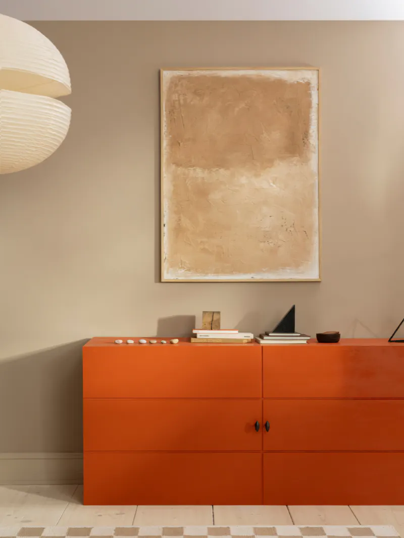
Keen to explore more shades? Tikkurila's vast colour palette covers over 2000 unique shades. Explore more here.
Colour of the Year 2027
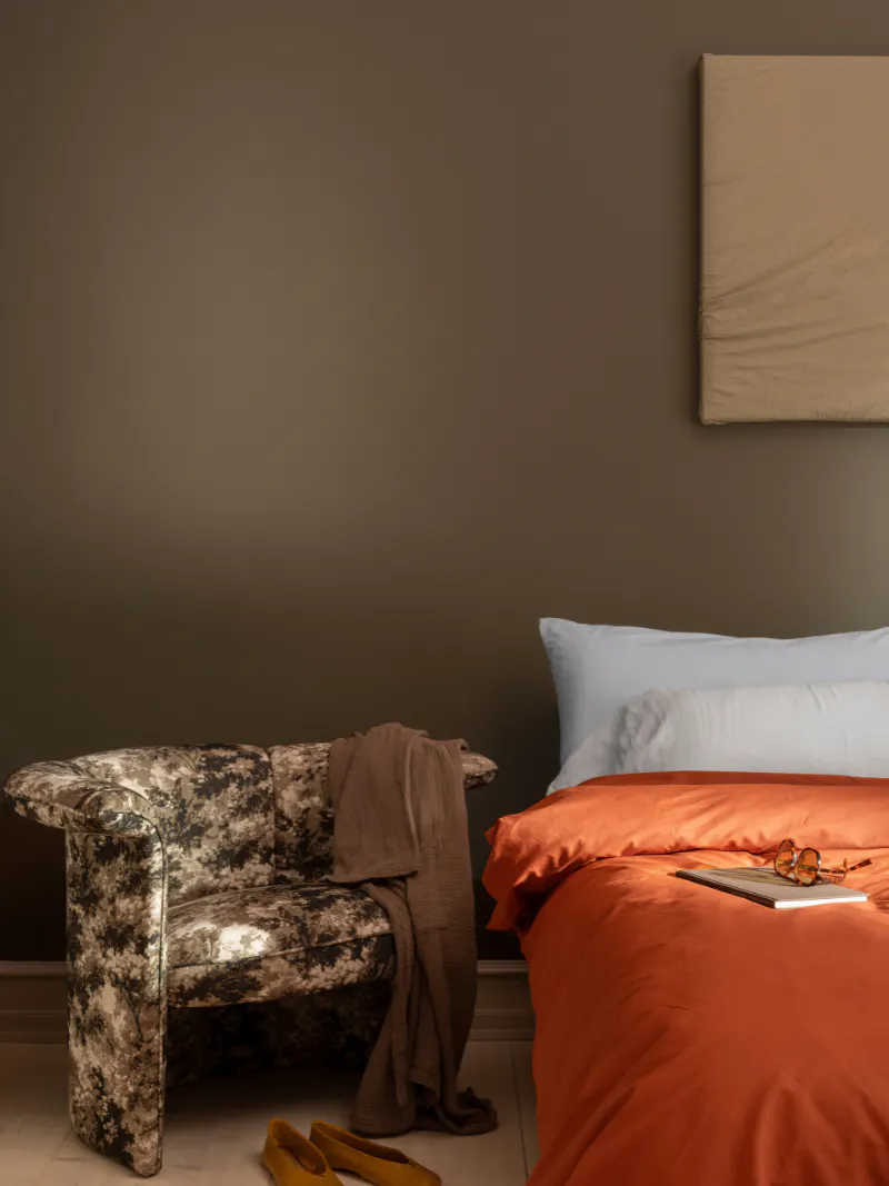
A warm stone beige that acts as a grounding thread throughout the 2027 collection.
Bring Color Now Home
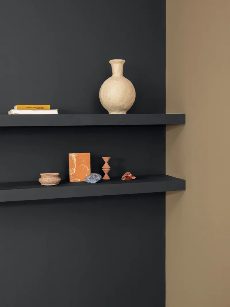
Explore inspiration to bring the versatile tones of Color Now 2027 into your home with some inspiring pairings.