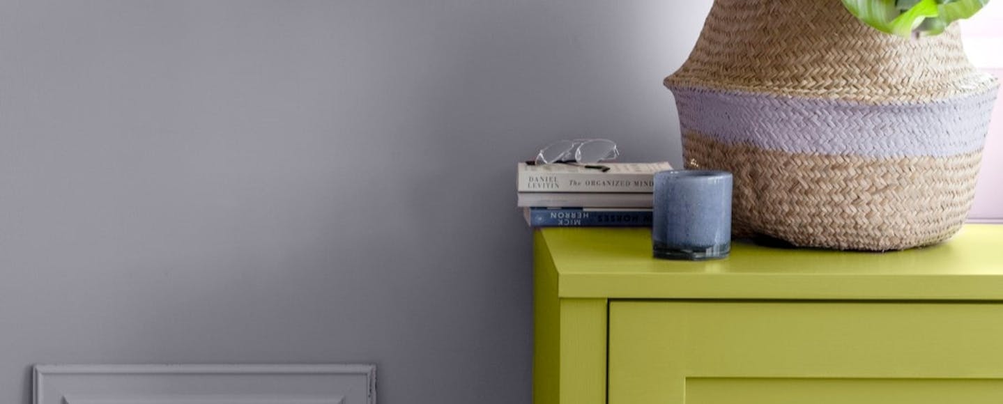
Pale purple and lime green colour clash

With interior design trends ever-changing, it can be hard to stay up-to-date with the latest new craze and if you’re familiar with Barbiecore and dopamine decor, you won't be a stranger to bold interior design choices by now. 

One prominent trend in interior design emerging in 2023 revolves around the use of contrasting colours to create bold and impactful statements. Bright, vibrant paint colours that clash, do understandably make even the bravest of people hesitant. However, when executed right, they have the potential to create some striking rooms that can really elevate your space - potentially even adding value to your property. 

Whether you’re looking to redesign a room to give it a new lease of life or you’re starting with a blank canvas - the colour clash combinations you choose will determine the feel and vibe of your space. Here are some of our favourites: 

Orange and pink

These two playful colours sit so closely on the colour wheel that they aren't typically thought of as an obvious match. Yet when combined, they exude vibrancy and energy. A hot combination of sunset tones that really shouldn’t work but do - and look particularly inspiring in traditional settings. 

Work a vivid and earthy hot orange as the focal point in your design, and complement with varying shades of deep pink to infuse the space with a dynamic and colourful ambiance. Or go for a full-blown colour crush, pairing the juicy vibrancy of magenta with the zesty charm of clementine. To maintain balance, introduce cooler tones like a delicate baby pink into the scheme.

For a more subtle take on this trend, consider incorporating a neutral backdrop, especially in calm spaces like bedrooms. Playful prints and patterns can assist in merging these colours in a more subdued manner, offering a gentler visual impact compared to painting walls in contrasting hues.

Our Favourite Pairing

Heat S311
Fiery Tangerine
Magnolia H320
Floral Pink With Hints Of Orange

Blue and green

Blue and green should never be seen’, the age old saying goes. However, we wholeheartedly disagree! The combination of blue and green yields one of the most dreamy and enchanting colour palettes. 

As with pink and orange, green and blue are close companions on the colour wheel, colour neighbours so to speak. Their closeness creates a sense of unity within a scheme, visually tying a room together. And usually, if it works in nature it works on paper, or better, our walls. 

Our favourite combination of these tones? The luxurious and rich clash of emerald green and teal blue. A fusion of modernity and luxury, this pairing exudes an inviting opulence.

The key to successfully combining these jewel tones lies in layering multiple shades to create a cohesive and refined look, delivering a rich and intense visual impact. 

Sapphire, emerald, amber, ruby and amethyst - these jewel tones collectively form a vibrant and luxurious treasure trove capable of elevating any interior scheme. Work in textured materials like velvets and combine them with gold and metallic accessories for elevated glamour.

Our Favourite Pairing

Chopin's Jacket
Deep Caribbean Aqua
Fjord M442
Misty Green-Grey

Clashing metals

Traditionally, the notion of blending silvers, golds, and coppers in design was considered a no-go. However, in contemporary interior design, this rule has become obsolete. Combining different metallic shades is now fair game, and what’s more, can generate a vibrant and energetic ambiance.

When combining warm and cool-coloured metals, opt for one dominant colour and one accent colour. Warm metals include gold, brass, and copper, while cool metals include aluminium, stainless steel, and other silver variations. Cast iron and black metals fall into the neutral metals category, and beautifully complement both warm and cool tones to add balance and can offer an easy in for those starting out with this trend.

Our Favourite Pairing

TVT 2034
TVT 2073


Lime and purple

Not for the faint-hearted, this combination is a true showstopper. Zesty lime hues are swiftly gaining popularity, particularly in the premium and youth fashion sectors, renowned for their gender-inclusive and dopamine-bright appeal. A vibrant yellow-green radiates expansiveness and exuberance.

But how can this bold pair find harmony within interior spaces? The answer lies in introducing another player: purple. Specifically, a soft, floral lilac-blue tone. These shades infuse a breath of fresh air, counterbalancing the liveliness of lime with a touch of sophistication and tranquillity.

Alternatively, soften the lime tone to a creamy mint green and team with soft purple for a harmonious and spring-like feel.

Our Favourite Pairing

Lilac J426
Sweet Lilac
Wasabi N388
Soft Tennis Ball Green


Yellow and white

A colour as bright and joyous as yellow, is one that will have you waking up to a bright and sunny morning even when it's raining. Traditionally yellow would be used sparingly as an accent colour because of its vibrancy as it can be quite full on. 

The safer bet is therefore to predominantly use pops of white with yellow accents. That said, if you are looking to go bold and make a real statement that provides an impact - then matching a colour as loud as yellow with white - which you may think doesn’t clash with anything, will actually create a striking contrast.

Our Favourite Pairing

Straw H456
An Elegant Pastel Yellow
Winter V503
Off-White With The Lightest Touch Of Grey


Burgundy and blue 

The two colours are adjacent in the light spectrum and the combination of the two creates a visually stimulating yet harmonious space. The deep, rich tones of burgundy evoke a sense of warmth and luxury, while the calming and versatile nature of blue adds balance and depth to any space.

Whether you choose to go bold or subtle, the burgundy and blue colour pairing can infuse your home with a sense of depth and style that's both inviting and timeless.

For a more daring approach, consider using burgundy as a primary colour and accentuate it with touches of lighter blues, such as teal or turquoise.

Our Favourite Pairing

Kestrel L478
Deep Brown With Cool Red Undertones
Cumulus Y354
A Calming, Light Blue Hue

Coral and aqua

Coral and aqua make for a vibrant and refreshing colour combination in your home decor that is remnant of the sea. Coral, with its lively and cheerful undertones, brings a burst of energy and warmth to any room. 

Pair it with aqua, a soothing and invigorating shade of blue-green, to create a harmonious balance of lively and calming elements making you feel as though you've found a serene oasis within your own living space.

This combination works particularly well in spaces that receive plenty of natural light, as it enhances the overall sense of freshness and vitality. The contrast between the two colours can create a soothing environment, helping you unwind after a long day and inspiring a peaceful night's sleep and a refreshing start to the next day. With that in mind this colour combination is well suited to a bedroom.

Our Favourite Pairing

Flamingo K319
Vibrant Pink-Red
Mosaic J367
Invigorating Light Blue-Green

The benefits of using the right colour combinations in your home

While interior design choices are often a very personal decision, it’s important to remember they can have an impact on the value of your property. 

Property expert, Tabitha Cumming at The Lease Extension Company explains: 

“Interior design choices can increase or decrease the value of a property, with some paint colours boosting the value by around 4% as some colours are favoured more than others. 

“When potential buyers first see a home, it is very likely that they will initially see photographs of what the interior looks like. Having a nicely decorated home can help a buyer to picture what it would look like when they live in it themselves, and potentially increase the amount that they may be willing to pay. 

“Additionally, first time buyers or buyers with lower budgets may not have an inclination to decorate a home themselves, or they may just want to be able to move straight in. 

“It is also worth noting that some paint colours can negatively affect the value of a property, with previous studies finding that potential buyers may decrease their offers by as much as £5,000 or be put off completely if they did not like a home's colour scheme.”

Paint Calculator

How much paint do I need? 

Use this calculator to work out your requirements, if you have any question please get in touch with one of our team who will be more than willing to help you.

Wall 1
Tell us about your paint choices

Disclaimer: Tikkurila UK Paint Calculator is provided as a guide only. The coverage rates will vary depending on surface being coated and the particular product range being used. More information on these products can be found on the cans, on the technical data sheets on individual product pages, by using our live chat service or by calling our technical team on 0131 334 4999.

Every effort has been made to ensure the accuracy of the estimate, however paint requirements may vary depending on the surface, type of paint, sheen level and colour chosen.