Are you looking for a contemporary neutral that’s easy to incorporate into any home? If taupe and greige aren’t to your liking, try oatmeal instead. As soft and creamy as the breakfast staple it’s named for, this classic paint colour will serve as the perfect backdrop in any room.
Unlike other neutrals, oatmeal can be used independently of more dramatic accent colours. It might be fairly low-key, but this stylish shade has a warmth that makes it ideal for creating a comforting and inviting space.
You can use it on its own for complete coverage of interior walls or enhance it with more daring colour pairings. Whatever painting project you’ve got lined up, oatmeal makes it easy to create stylish spaces you’ll be proud to call your own.
At Tikkurila, you’ll find an incredible selection of oatmeal paint colours. Shop the entire collection today and select express delivery so you can get to work on refreshing your interiors.
Parchment F466
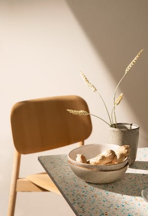
Oatmeal paint colours might be subtle, but they can still be transformative. Keen to refresh your favourite spaces with a stylish neutral? Try Parchment F466. This light bone hue can be used as the foundation for any oatmeal-inspired room palette. It’s an earthy tone with delicate hints of pink and a classic creamy character.
It’s also a warm shade, meaning you can use it as an all-wall colour in any space. Even though it’s on the lighter side, it can still be used effectively in living spaces and bedrooms, creating a cocooning effect to help you relax. If you want to add more intense shades to your palette, think about using a dark brown hue to paint feature walls or draw the eye to standout room details. Any brown with red undertones is going to work well.
Acropolis F458

Oatmeal might be a pared-back colour choice, but it can still bring unmatched levels of sophistication to your spaces. Acropolis F458 is an elegant earthy shade that will look right at home in any interior. It’s only a few steps away from pure white, but this gorgeous hue has a warm and comforting quality.
Use it in a living room if your space feels small and overwhelming. In a bedroom, use this hue to create a serene backdrop for your sleep space. You can even use it in dining rooms if you bring in darker accent tones like chocolate brown and warm grey.
Champignon G467
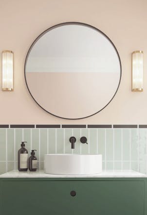
Looking for a more luxurious take on oatmeal? How about Champignon G467? Soft and creamy, this almond-inspired paint colour is clean and fresh, but it has a real warmth about it that will bring that comforting energy your space is calling out for.
This stylish shade works well with nude hues, but can also be coordinated with timeless neutrals like taupe for a more sophisticated scheme. Need to add vibrancy to your palette? Try pairing this colour with yellow-infused neutrals. If you want to keep things simple with a muted colour scheme, reach for refined browns with pink undertones.
Canvas G485

The right shade of oatmeal can enhance any interior. If you want an earthy neutral that can be used in a more contemporary space, try Canvas G485. Despite its alabaster grey undertones, this off-white is surprisingly warm, making it a superb choice for living spaces and bedrooms.
Whenever you feel like adding a coat of white paint to your walls, reach for this instead. As an all-wall colour, this shade will refresh any interior and really open things up. It can also be used alongside other hues as part of a tonal scheme. Try pairing it with warm beige, earthy greys or stony browns.
Mulberry H484
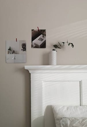
Are the oatmeal hues above not warm enough for your liking? How about Mulberry H484. This enchanting off-white brings the comfort factor to any interior, while grey undertones make it a fine addition to a more contemporary space.
The perfect choice if you’re keen to use grey neutrals to transform your home, but are worried you’re going to leave your interiors feeling cool and washed out. If you want to add more depth, try introducing a hint of warm greige to your palette. For a more dramatic design makeover, you can even think about using medium browns and intense umbers.
Where Do Oatmeal Paint Colours Work Best?
You’re free to use oatmeal paint colours on just about any surface. Does a spare bedroom need a refresh? Once it’s been painted with two coats of charming oatmeal, that unloved space will be ready to welcome overnight guests. You can also use it in your own sleep space. Choose a warm and alluring oatmeal as your primary colour, then select a more daring shade to create a feature wall. Once you’ve taken care of the paintwork, dress your space with cotton sheets, light-coloured furniture and a linen screen.
If the usual neutrals have left your living room looking cold and uninviting, consider using oatmeal instead. This warmer take on taupe is perfect for spaces that are lacking that cosy quality. You can use the same shade on every wall, or mix things up by using earthier hues to create tonality. Stick to off-white for decorative finishes and interior door surfaces.
If you’re lucky enough to have a large hallway, an oatmeal colour palette can work wonders. This enticing neutral will bring warmth and a welcoming quality to the entrance of your home, putting you at ease when you cross over the threshold.
What Colours go With Oatmeal?
Finding paint colours that work with oatmeal shades is quite easy given how open and easy going they are on the eye and to decorate with. A few paint colours to consider when decorating with this tone includes rich, earthy hues such as deep browns, luxurious reds, or head into another direction entirely and explore lighter hues such as pale grey or soft neutrals.


