If you're searching for an easy way to inject sophistication into a room, olive paint colours are worth considering. As with other green colours, olive has an unmistakable earthy quality, bringing a sense of serenity to your surroundings.
Olive green paint is perfect for bedrooms, but it can also be used to paint walls in dining rooms and living spaces. Paired with natural accents and wooden furniture, an olive-infused room will instantly put you at ease.
Are you worried that olive won't leave you with many design options? Don't be. This rewarding colour is imbued with other shades like yellow and blue, giving you endless options for coordinating a winning decor scheme that will breathe new life into your interiors.
At Tikkurila, we offer an incredible range of rich olive paint colours. Need some inspiration? We've picked 10 of our favourite olive paint colour options for you to consider.
Olive Grove V451
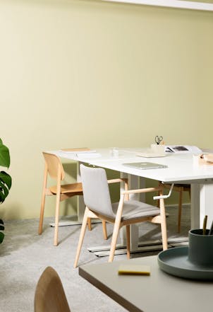
If you're a fan of more muted decor, an olive shade like Olive Grove V451 is something to consider. This inspiring shade evokes the colour of dried sage, with plenty of earthy character that brings the spirit of the outdoors to your interior spaces.
Because it's on the softer side, this paint colour can be used liberally to paint an entire room or open-plan space. It's perfect for more traditional living rooms and dining spaces. However, it'll also work well with Scandi-inspired schemes.
For best results, pair this one with lighter woods and simple white furniture. When choosing complementary colours, stick to misty greys and darker greens to create depth.
Try a Colour Out
Nile V386
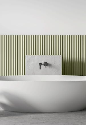
Thinking about giving your bathroom a makeover? A soothing olive shade like Nile V386 will make a welcome addition to your palette.
This mid-green hue is a stylish alternative to off-white shades and grey paint. It instantly promotes a feeling of calm, making it an effective choice for those spaces you need to relax in.
Take a moment to consider secondary colours to make the most of this inspiring olive. It works particularly with crisp white, as well as neutral tones and charcoal. If you want to bring more green character to your spaces, experiment with mossy shades.
Sepal L447
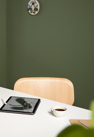
If you want a colour that will make more of an impact, go with Sepal L447. This bold olive shade makes a statement thanks to its richer pigment and yellow undertones. Although darker than some of our other options, it's still a vibrant choice and will bring that earthy character you're looking for.
It's a solid choice for living spaces and dining rooms, making it an ideal all-over wall colour. If you're decorating a smaller space, balance things out with an off-white or alabaster shade.
To enhance the innate beauty of this green, introduce grey and brown shades to your palette. Furniture choices are also important. Stick to light-coloured woods where possible and decorate your space with organic materials and natural accents.
Jade V449

Olive greens are certainly serene, but they're also a sophisticated choice. If you're searching for a stylish shade to overhaul a living room, go with a colour like Jade V449.
This matte green is a lighter take on olive, with creamy undertones making it a low-key addition to any interior. You can use it liberally to decorate larger rooms, although pairing it with a bold contrast can also work incredibly well.
For a timeless decor scheme, use understated hues whenever possible. Vanilla-inspired shades are a safe bet, although just about any neutral can be worked into the mix.
Amazon M386
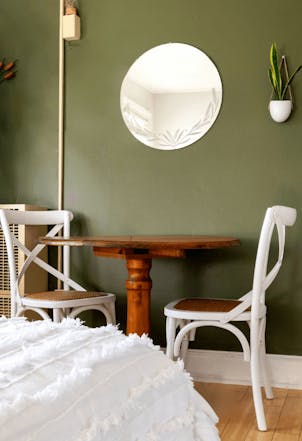
There's nothing drab about olive green. Amazon M386 is one of our more vibrant shades, combining rich pigment with an essential earthiness.
Use a pop of this to bring drama to a more muted space. Alternatively, go all out and use it to paint every wall. A versatile pick, this daring olive works well in traditional spaces, but also shines in more contemporary rooms.
Hardwood floors and crisp white furniture will also work nicely with this olive wall colour. If you want to lean into the natural-inspired pigment, experiment with darker browns and syrupy hues when adding secondary colours to your palette.
Arbour S451
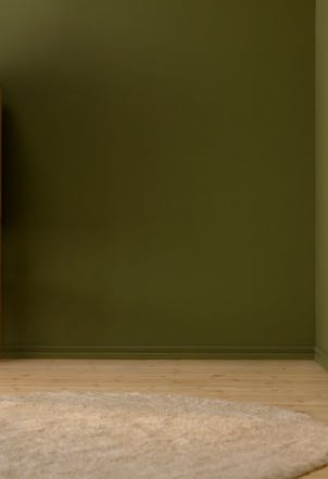
Olive can be warm and welcoming, but it's all about selecting the right shade. A colour like Arbour S451 is a real standout, with a pigment that's rich in yellow and red. The result is a deep khaki that's not lacking in character.
This one's a superb choice for spaces like dining rooms. Use it as your key colour in larger rooms, or combine it with softer shades for two-tone decor.
If you're keen to introduce complementary colours, it's best to stick with things like beige or unassuming neutrals. If you're not afraid of more daring colourways, take your lead from the red undertones and work in some crimson-infused hues.
Waterlilly

This shade looks a little different to most of our other olives. With its mossy pigment and undertones of blue and grey, Waterlilly is a welcome alternative to those looking to move away from conventional greens.
Soothing and stylish, this mossy olive is a fine pick for bedrooms, bedrooms and living spaces. If you want to create a cool and calming interior, stick to pure white or neutrals when decorating those finishing touches.
For a stripped-back interior, furnish your room with light woods and simple pieces. If you're using this as your primary colour, adopting a "less is more" approach is the way to go.
Monkey

Here's another departure from standard olive. Monkey is something to consider if you're after a warming neutral. Although it's the mid-tones of yellow that really stand out, the olive undertones are hard to miss.
This sophisticated take on olive can be used on its own, or alongside jewel tones. If you're using more vibrant greens elsewhere, save this one for recesses and nooks.
Be creative when selecting room accents. Gold and copper will bring out the warmth of this colour, while subtle citrus shades can also work well.
Flannel J446
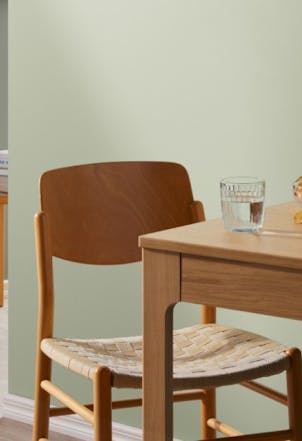
Here's another sage-inspired shade we know you'll love. If you're thinking about decorating a bathroom or giving a living space a new lease of life, Flannel J446 is a fantastic choice.
Calming and understated, this olive green is infused with plenty of grey pigment. In larger spaces, this low-key colour will bounce light around with ease. In smaller spaces, it'll keep things feeling fresh.
You can play it safe with light woods and all-white accents when adding those finishing touches. Alternatively, embrace richer neutrals and sumptuous creams for a more sophisticated interior.
TVT H451
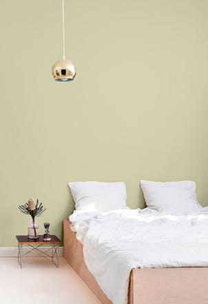
Finally, we have Tvt H451. This matte olive shade looks right at home in any space. One of more subtle olive greens, this paint colour will bring some energy to any room.
If you're decorating with this shade, complete the look with grey and blue-infused neutrals. Looking to add some depth to an all-white room? This is the perfect neutral for feature walls.
However, you have free rein with this one. If you want to brighten things up, reach for golden yellows or dusky pinks to infuse your rooms with drama.


