Ready to reimagine your living space, but want to move away from the neutrals you’ve been using for years? Now’s the time to introduce yourself to the sunshine hues of a yellow colour palette.
Yellow wallpaper tends to get a bad rap, while yellow paint is usually reserved for subtle pops of colour or a feature wall. However, there’s a lot to love about this vibrant colour family.
Provided you choose the right shade for your space, yellow walls can bring much-needed energy and life to your interiors. You can even decorate the whole room with an assortment of soft shades and complementary colours.
At Tikkurila, you’ll find an incredible selection of yellow paint colours. From lemon-infused neutrals to warm yellow hues, you’ll find the perfect shade to turn your yellow living room ideas into a reality.
Why Use Yellow Paint Colours in Your Living Room?
Yellow living room design ideas don’t have to overwhelm the senses. While neon yellows might prove too much for some, a warm yellow paint colour can enhance the comfort credentials of your living space.
In living rooms with little light, yellow can help create the illusion of extra space. Lighter hues are perfect for bouncing around natural light, even if you’re limited to small windows and tiny skylights.
A yellow room palette also has a mercurial quality. During the sun-drenched daylight hours, yellow walls can make a space feel fresh and open. Come the evening, those richer hues take on a new dimension when sunlight is replaced by the warm white of artificial bulbs.
What’s more, yellow isn’t a difficult colour to work with. Those with eclectic design tastes will have no trouble pairing yellow walls with furniture and decorative pieces.
Keep it simple with a grey sofa and natural accents if you’ve gone with a lighter shade. If you’re using a more vibrant yellow, make a statement with monochrome accents or dress a corner sofa with teal throws and burnt orange scatter cushions.
Our Favourite Living Room Yellow Paint Colours
Considering using yellow in your own living room? Below are some of our finest yellow paint colours for you to consider.
Papyrus Y392

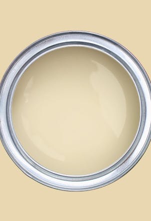
If you’re in the market for a more subdued yellow, think about using Papyrus Y392. This elegant colour works well on its own, but it also pairs beautifully with jewel tones for a more sophisticated interior.
Its richer base also means it will coordinate well with red-based browns, although more intenses shades with red and purple undertones can also prove effective.
Joy H303

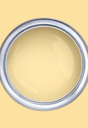
For a more luxurious living room, think about using Joy H303. This velvety yellow is low-key but uplifting. It’s ideal for rooms that need brightening up or suffer from a north-facing orientation.
However, it will also make a welcome addition to rooms that receive ample natural light. For a clean and crisp interior, pair it with pure white accents, natural wood and fresh drapes and soft furnishings.
Parmesan F302

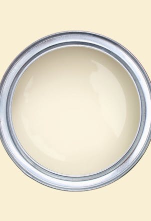
Creamy yellows work particularly well in living rooms. Parmesan F302 might seem like a subdued choice, just a couple of coats of this colour will give your living space the refresh it needs.
It’s a solid alternative to off-whites and other neutrals. You can use it on its own, or pair it with more intense yellows. Alternatively, use it alongside jewel tones for a more elegant aesthetic.
Eggnog Y308

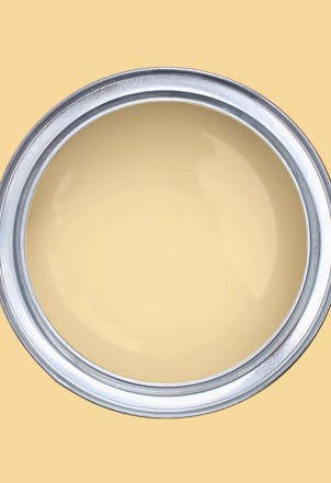
If you’re looking for a colour that’s uplifting, but not too bright, think about using Eggnog Y308. This appealing yellow will leave your living room feeling warmer and more energised.
You can use it as an all-wall colour or create interest by pairing it with pastel yellows. You can even accentuate it with pink-finished complementary colours or punctuate with blue walls to create contrast.
Yellow Living Room Colour Schemes
If you want to use yellow well in your living room, you need to be using the right complementary colours. Need some inspiration? Below are some tried and tested colour combinations.
Creamy Yellow, Contemporary Blue and Pure White
Yellow and blue are made for each other. To pull off this classic colour combination, start with a lighter yellow like Papyrus Y392. It’s light and refreshing, while subtle hints of pink bring extra warmth.
Now it’s time to introduce some blue. A mid-tone blue like Atlantis L433 will work nicely here, especially if you’re looking to create a more contemporary living space.
Finally, you’ll need a neutral to take care of those smaller details. You don’t want to detract too much from your other colour choices, so go with a pure like Paper F497.
Mid-Tone Yellow, Light Grey and Dark Blue
For a more laid-back living room, use a mid-tone yellow like Butter Milk H392 to get things started. With its creamy character, it’s a subdued choice that will create a more relaxed living room interior.
Along with blue, grey is another synchronous shade that works well with yellow. Use something like Tuft H495 if you don’t want to steal too much attention away from those yellow walls.
Want to make a statement with a feature wall? Use a dark blue like Petrol S491. With its smoky undertones, it’ll also tie nicely with any grey complementary colours you’ve used.
Soft Yellow, Off-White and Dusky Blue
In a smaller space, it’s often best to stick with softer yellow colours. A creamy hue like Eggnog Y308 will work well in living rooms that lack generous dimensions.
A traditional neutral will make a welcome addition to your palette. Go with Winter V503. This off-white works well in place of purer shades, while a hint of grey will enhance your room’s aesthetics.
Finally, create some subtle contrast with a blue colour. Sandman V431 is a stylish choice. This medium blue might look a little dark, but its dusky character means it’ll work well alongside softer yellows and off-white neutrals.
Fresh Yellow and Tonal Blues
For a more vibrant makeover, don’t be afraid to experiment with bolder shades. Start with a refreshing yellow like Lemonade H300 to brighten up your living room interiors.
Next, introduce a light blue into the mix. Something like Prince G490 will go down well, with its grey undertones bringing extra depth to your decor.
Now you can make a statement with an intense blue. Try using Madolin Blue. It’s a pretty deep shade, but it has a fresh and vibrant quality that will tie in nicely with your other colour choices.


