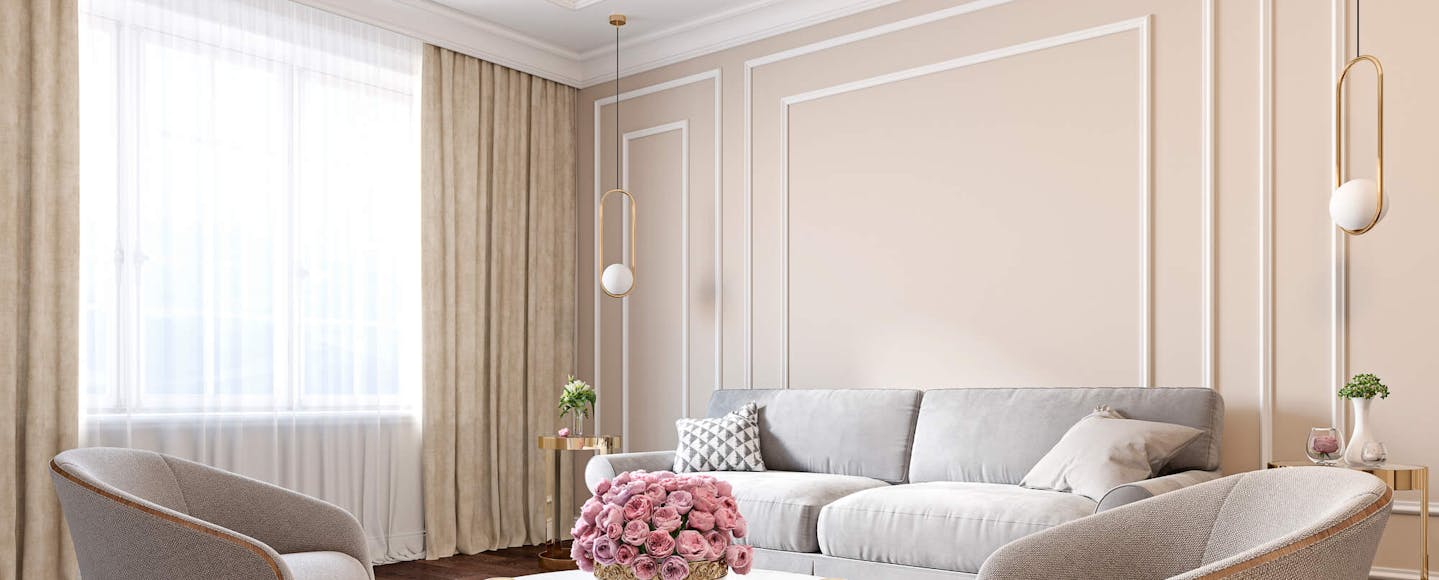
1930s interior design is often characterised as being rich in luxurious accents, geometric patterns and ornate parquet flooring. However, 1930s design trends are generally confused with those found during the height of the Art Deco movement. While Art Deco trends continued into the 1930s, they became more subdued, with a greater dependence on muted interior colours.
With many people still feeling the pinch of the Great Depression, there simply wasn't money to throw at house renovations and decorating projects. Instead, people looked for simple ways to enhance their walls, such as premium paint colours and restoring existing features like stained glass windows.
However, it's not fair to write the 1930s off as an era of impoverished design options. In fact, it was during this decade that the average consumer could finally access diverse colour charts and unusual paint options.
Looking to bring some 1930s character to your own home? At Tikkurila, we stock an incredible selection of vintage paint colours that are perfect for bringing some 1930s character to your rooms or enhancing a period property with era-authentic hues.
What Colours Were Prevalent in the 1930s?
1930s paint colours are typically soft and subdued. An authentic palette is rich in cool tones like grey and blue. Muted pinks and dusky shades are also synonymous with this era, while forest green and burgundy are ideal for those looking for something more sophisticated.
Creamy neutrals are another good choice if you're planning on emulating a 1930s interior. These versatile shades, enriched with yellow undertones, work well alongside softer colour schemes.
Colour Inspiration for Creating a 1930s Look
Ready to transform your room with a 1930s palette? We've picked out some of our finest vintage paint colours for you to try.
Darker Reds
Reds work well in dining rooms and living spaces, especially if you're looking to create a more intimate space. During the 1930s, darker reds were the preferred choice.
Try something like Kestrel L478 for a more grown-up interior. This dark brown works well alongside earthy shades and muted 1930s tones, with rich red undertones adding a touch of elegance. You can also incorporate dusky hues and jewel tones into the mix.
If you're looking for a more vibrant paint colour, try Rooibos M476. Deep and intense, this burnt red works well alongside jewel tones. If you're decorating a smaller room, try experimenting with two shades for a timeless tonal look.
Test a Colour Out
Oranges are another stunning design choice and perfect for creating houses with period features. Lounges painted in bold oranges are particularly effective, particularly in spaces with round-edged furniture made from darker varieties of wood.
Try a mid-tone orange like Harvest V406. A gorgeous alternative to traditional terracotta, this orange adds warmth and promotes a feeling of relaxation. If you want to make more of a statement, try using textured or patterned wallpaper on a single wall.
For a more intense take on this citrus colour, go with Folklore S315. This deep burnt orange will work well in a room inspired by the 1930s, but it also looks right at home alongside more contemporary accents.
Warm Neutrals
Neutrals can be used effectively in any interior. However, the most authentic 1930s neutrals should be on the warmer side of the spectrum.
Try a taupe like Weekend H462 if you want a more stripped-back interior. This elegant neutral is enhanced with nude undertones, which will work well with darker materials and monochromatic room accents.
Halva G459 is another good option if you're looking for an assuming neutral to create a timeless interior. Use this beautiful beige alongside jewel tones or caramel browns for a luxurious lounge. Alternatively, coordinate with dark woods and purple-infused shades for a dramatic dining room makeover.
Pale blues became incredibly popular during the 1930s. They're a fine choice if you're thinking about overhauling your hall. Use a muted blue for walls, then stick to an off-white when painting the ceiling or interior door panels.
Glacier Y435 is perfect for larger spaces that need brightening up. Although this fairly cool hue, its grey undertones mean you can introduce all manner of complementary colours. If you want to avoid pure white, go with gentle greys to bring your decor scheme together.
Prince G490 is another stylish pick if you're interested in embracing a blue palette. This lighter shade works well in large rooms, with a grey tint making it a versatile choice of all-wall colour.
Luxurious Greens
If you find other 1930s colours too tepid for your liking, consider using green instead. Everything from sage shades to forest greens can be used here. You can use them in any room of the home, although they're incredibly effective in living spaces and bedrooms.
A medium green like Silk Road S440 is ideal if you want to brighten up any interior. With hints of blue, this paint colour brings a cooling character to any space and pairs well with greys and whites.
Menthol J442 is a more vibrant alternative. Combining elements of green and blue, this minty hue will freshen up any wall and works well with whites, greys and sunnier shades like yellow and orange.


