Period Design
Period Paint Colours: Bringing a Traditional Appeal to Your Home
Making sense of period paint colours isn't an easy undertaking. There are hundreds of years of interior design trends to wrap your head around, with each era boasting its own unique palettes and decor preferences.
Many people turn to period paint colours to restore properties to their original appearance. Others use them for creative design projects, combining elements from multiple eras to produce eclectic interiors unlike any other.
At Tikkurila, we stock a stunning collection of period paint colours. Whether you're looking to replicate the majesty of the Regency era or make the most of mid-century modern design, we've got you covered.
The Appeal of Period Paints
We all want to put our stamp on the spaces that we call home. However, many of us reach for tried and tested colour staples like neutral tones when it comes to decorating. These are handy if you want to create a blank canvas, but they can leave rooms feeling sparse and sterile.
For a truly inspired makeover, period paint colours are the obvious choice. In Britain, design trends have evolved considerably over the last few centuries, although every era has produced a lasting legacy.
From the rich tones of the Victorian era to the playful palettes of the 1970s, period paint colours can bring any room back to life and restore the character of a bygone age.
Which Eras of Design Are There to Choose From?
Eager to ditch spartan aesthetics for a more traditional finish? There are plenty of eras you can draw on to create a captivating interior. We've picked out some of the most iconic periods for you to consider.
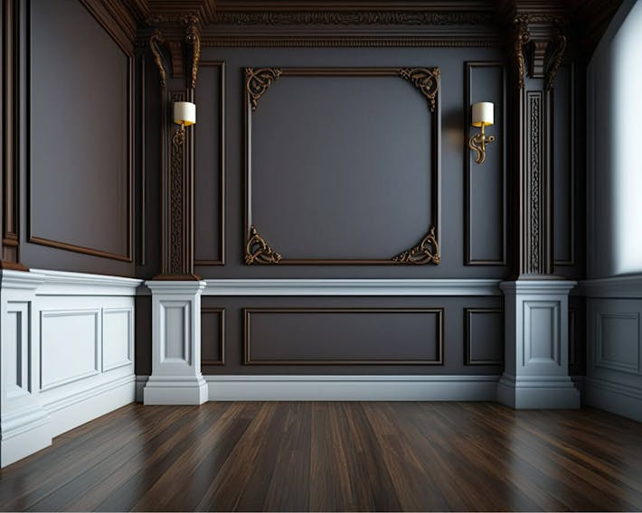
Victorian
As the name suggests, the Victorian interior design dates back to the Victorian era. If you're decorating a home that was built during the 1800s, there's a good chance your space will feature at least some design accents from this era.
The Victorians went big when it came to interior design. Eclectic decor and elegant ornamentation were the go-tos for those who could afford them. Authentic Victorian interiors are rich in decorative elements and architectural details, but you don't need to have original features to capitalise on this enduring design trend.
Intricate textiles and wallpaper were used in abundance during this era, but they can prove a little overwhelming. If you're overhauling a smaller space, it's best to stick with a Victorian-inspired colour selection instead.
Mid or deep tones are the way to go here. Think about using dramatic shades like chestnut, maroon and burgundy to paint your walls. To create a stunning point, reach for more opulent hues like sapphire blue and forest green.
Do you prefer a softer look? Jewel tones are synonymous with the Victorian period and coordinate effortlessly with earthy hues and white or pale tones alike. You can also incorporate more contemporary flavours like slate grey and staple monochromes.
Edwardian
Next comes the Edwardian era. Despite being a relatively short-lived period, this era has left a lasting mark on architecture and interior design.
There's a fair bit of crossover between this era and the Victorian period. However, what sets Edwardian decor apart is its colour collection. Although you'll find plenty of mid-tones and richer shades, these are usually reserved for spaces like reception rooms.
This transitional period is when pastel hues became a staple of interior design. Pale greens, lilac and light yellows can all be found in a typical Edwardian space. What's more, staple shades like duck egg blue finally became a popular choice.
Although Edwardian decor works well in period properties with eclectic architectural details, this classic colour palette also benefits more contemporary spaces. These pared-back tones bring an airy feel to any room, while patterned wallpaper can be used to create a dramatic focal point.
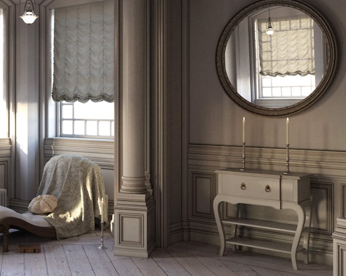
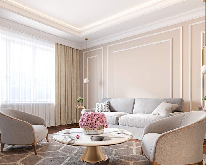
Georgian
The Georgian period encompasses more than a century of British history, spanning the reigns of no less than four kings. Unsurprisingly, Georgian design boasts many different characteristics, with some aspects falling in and out of favour during the 1700s and early 1800s.
Generally speaking, Georgian design is characterised by things like high ceilings and decorative columns. However, you don't need a period property rich in architectural details to capitalise on Georgian decor.
Symmetry is a hallmark of Georgian interiors, with this design approach easy to implement in everyday homes. What's more, affordable accents like cornices can be applied with relatively little effort.
In terms of colour choices, pastels make a good pairing with Georgian-inspired interiors. However, if you want to be a purist, you'll need to stick to a colour card inspired by the natural world.
Back in the 1700s, paint-enriching pigments were fairly difficult to obtain. As such, most walls were coated with everyday colours like stone, grey and earthy hues.
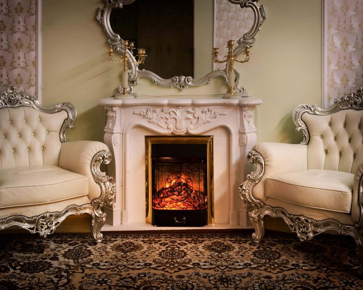
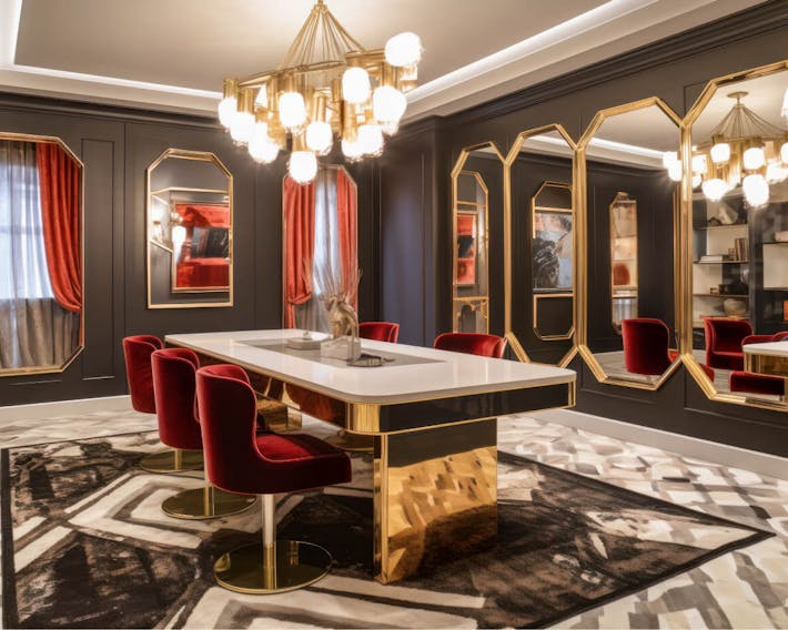
Art Deco
The art deco trend exploded in popularity during the Roaring Twenties. Synonymous with luxury and decadent design, it's still popular today.
A rich colour palette, geometric motifs and high-end materials are the bare minimum you'll need to pull off the art deco look. However, even a room decked out in subtle white can be enhanced with a few choice accents.
When adding layers to an art deco-inspired room, reach for metallics and bold yellows. deep reds, opulent greens and eye-catching pinks all work well here. Black and silver prove particularly effective when it comes to putting the finishing touches to an art deco interior.
Mid-Century Modern
The mid-century modern design movement focuses on practicality and functionality. It emerged in the wake of World War II and has enjoyed a resurgence in recent years.
Unlike previous periods, which put a premium on ornate accents and luxurious finishes, the mid-century modern trend took inspiration from the world of architecture. Furniture from this era generally features clean lines and gentle curves, with durable materials like teak being the preferred choice.
If you're thinking about mid-century modern decor, you'll want to take inspiration from your furniture. Rusty reds, mustard yellows and grey-infused blues all work well alongside dark varieties of wood.
However, there's still room for a subtle touch of luxury here. The occasional flourish of gold or silver can work wonders in a mid-century modern interior.
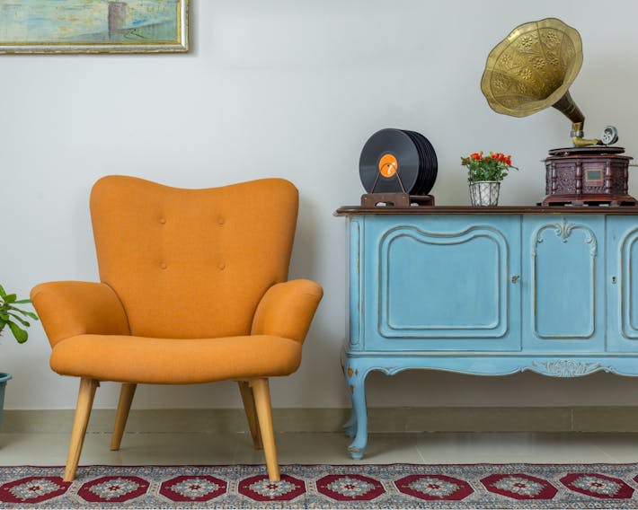
Vintage
This is a fairly broad subcategory of interior design. It doesn't refer to a specific period, instead putting a focus on reclaimed and repurposed pieces from previous eras. However, it typically applies to interiors that take style notes from the 1960s and 1970s.
Some vintage interiors are like-for-like recreations of rooms past. Others combine elements from different decades to deliver a truly unique arrangement. If you're using pieces from the 1970s to bring a room together, you'll want to use shades like avocado, sunflower yellow and chocolate brown.
Regency
Technically speaking, the Regency era forms part of the Georgian period. Regency interiors share many signatures with Georgian ones, but there's more of an emphasis on flamboyant luxury and lavish decoration.
Authentic Regency interiors celebrated design influences from across the known world, with display pieces sourced from far and wide. The advent of striped wallpaper can also be traced to the Regency era.
While Georgian design was limited to commonplace colours, the Regency era had a far richer palette to work with. Vibrant blues, pea greens and yellow-infused pinks were now easier to source, resulting in rooms with far more character.
Why Should You Consider Period Paint Colours for Your Next Decorating Project?
Are you looking to restore a period property to its former glory? Coating your interiors with a single neutral shade might seem like a good idea, but it can sap the soul out of a historic property. Instead, do a little research to determine when your property was built and put together a sympathetic colour palette that will enhance those long-forgotten features.
However, you don't need a centuries-old property to reap the benefits of period design. Modern properties can also be brought to life with a palette infused with period paint colours. Decorating a contemporary building with high ceilings? Look to the Georgian era for colour guidance.
If you want to create a cosy and comfortable space in a property dominated by open-plan layouts, look to mid-century modern design. Muted tones and earthy shades pair beautifully with contemporary colour choices like off-white.